

 US Dollar
How to Match Fabric Patterns for Seamless Quilts
Posted by BLG on 2026 Jan 9th
Posted by BLG on 2026 Jan 9th

Most American quilters know that choosing fabric patterns can make or break a project, yet over 60 percent struggle with achieving cohesive results. Selecting and matching textiles is about more than just colors and prints, it shapes the impact and beauty of your finished quilt. Understanding how to coordinate patterns effectively will help you turn inspiration into stunning designs with every project, building confidence and a creative eye for both amateur and professional makers.
| Key Point | Explanation |
|---|---|
| 1. Gather essential supplies first | Collect needles, threads, and fabric samples that represent colors and textures for your quilt project. |
| 2. Analyze fabric patterns and colors | Understanding color schemes and pattern types enhances visual storytelling in your quilt design. |
| 3. Select harmonious fabric combinations | Choose fabrics that complement each other to create a cohesive, visually appealing quilt layout. |
| 4. Arrange for visual flow | Strategically place fabric pieces to ensure smooth transitions and a balanced overall composition. |
| 5. Verify with a mock assembly | Using a mock layout allows for adjustments and helps identify any mismatched patterns or colors before final assembly. |
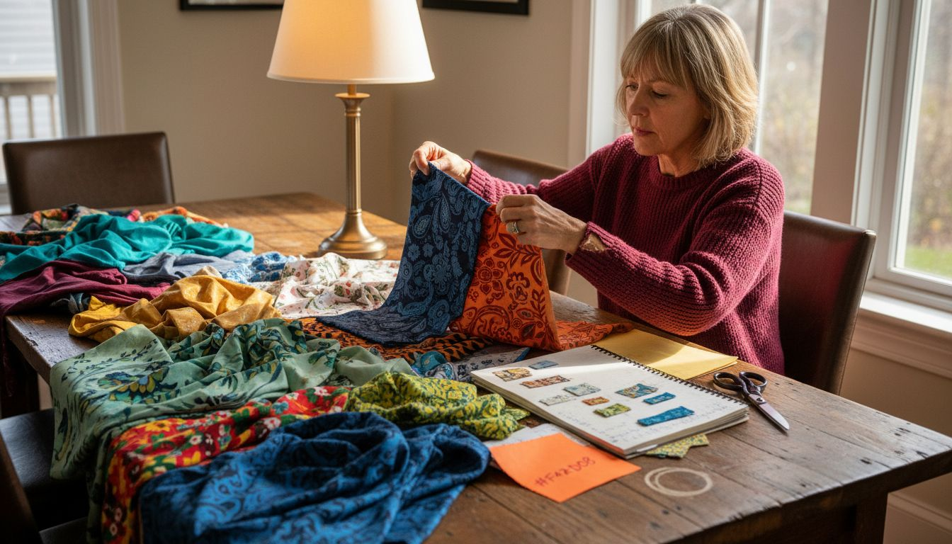
Preparing for your quilt project starts with assembling the right materials. Collecting textile samples and reference swatches allows you to visualize color combinations and pattern interactions before committing to your final design.
Begin by gathering essential quilting supplies like fine needles, threads appropriate for quilting weight (12-weight or Pearl cotton), small thread snips, and a comfortable thimble. Choose threads that complement your fabric selections and provide durability. Your fabric samples should represent a mix of colors, textures, and patterns that create visual harmony. Consider collecting swatches from different fabric types cotton, silk blends, or quilting cottons to understand how they interact.
Examine each fabric sample carefully against natural and artificial light to assess its true color and how it might blend with other selected materials. Lay out your samples side by side, creating potential color combinations that tell a visual story through your quilt design.
Pro tip: Create a dedicated fabric swatch board or notebook where you can pin or attach samples, making it easy to compare and reference materials throughout your quilting journey.
Quilt design begins with understanding how different fabric patterns and colors interact to create visual harmony. Exploring fabric motifs and pattern structures reveals the intricate storytelling potential within your textile selections.
Traditional quilt patterns like Dresden Plate, Log Cabin, and Flying Geese offer rich design foundations. Each pattern type carries unique visual characteristics that influence how colors and shapes communicate. When analyzing patterns, consider the scale of motifs, repetition frequency, and how different fabric designs complement or contrast with each other. Pay attention to symmetry, color intensity, and the emotional response each combination evokes.
Color selection transforms a good quilt into an extraordinary one. Examine how different hues interact by creating color value gradients and understanding complementary color relationships. Look for patterns that create depth through strategic color placement and variations in tone.
Here’s a quick reference to common quilting pattern types and their design impact:
| Quilt Pattern Type | Visual Characteristics | Design Impact |
|---|---|---|
| Dresden Plate | Circular motifs, scalloped edges | Adds vintage charm, focal interest |
| Log Cabin | Repeated rectangles, strong lines | Creates structure, versatile layout |
| Flying Geese | Triangular shapes, directional flow | Adds movement, dynamic visual paths |
Pro tip: Create a color wheel reference and experiment with different fabric combinations against a neutral background to truly understand their visual interaction and potential.
Creating a visually stunning quilt requires thoughtful selection of fabric patterns that work together seamlessly. Mixing prints and color palettes helps you develop a cohesive design that tells a compelling visual story.
Start by establishing a dominant color theme and then introduce complementary prints that enhance rather than compete with each other. Consider balancing large scale prints with smaller geometric or solid fabrics to create visual interest. A successful pattern combination might include a bold floral print paired with subtle geometric designs or a mix of different sized patterns that share a consistent color family. Think about creating depth through variation in print scale and ensuring no single fabric overwhelms the overall composition.
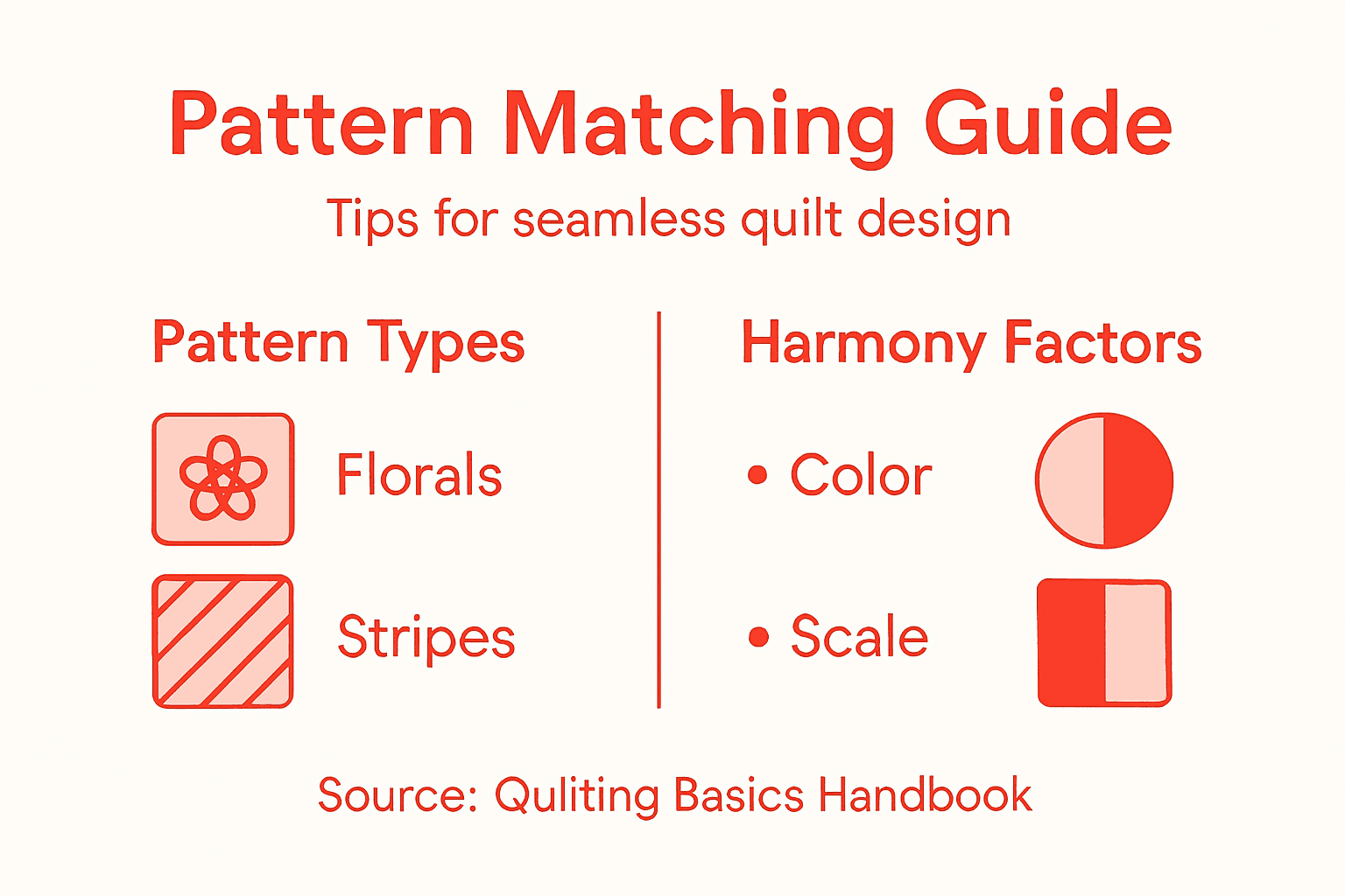
When selecting pattern combinations, aim for a sense of intentional variety. Mix different pattern types such as florals, stripes, geometrics, and solids to create dynamic visual texture. Ensure that your chosen fabrics have a common color thread that connects them visually and prevents the quilt from looking disjointed or chaotic.
Use this summary to ensure pattern combinations in your quilt feel cohesive:
| Pattern Type | Pairs Well With | Effect on Design |
|---|---|---|
| Florals | Solids, small geometrics | Softens bold motifs, adds flow |
| Geometrics | Florals, stripes | Provides structure, contrasts organic forms |
| Solids | Florals, geometrics | Balances busy patterns, calms layout |
| Stripes | Solids, small florals | Adds rhythm, enhances linear direction |
Pro tip: Lay out your fabric selections on a large white or neutral background and photograph them to assess how the patterns interact and flow together before committing to your final design.
Transforming a collection of fabric pieces into a cohesive quilt requires strategic planning and intentional design. Quilting composition principles help guide your fabric placement to create a visually compelling narrative.
Begin by understanding the fundamental design rules that govern fabric arrangement. Use the rule of thirds as a visual guide to create balanced and interesting layouts. Avoid clustering similar patterns or colors in one area by distributing them thoughtfully across your quilt. Consider how each fabric piece interacts with its neighbors the transition between patterns should feel smooth and intentional. Think about creating visual paths that guide the viewer’s eye through the quilt design creating rhythm and movement with your fabric selections.
Experiment with different block arrangements and seam alignments to discover the most harmonious configuration. Take time to step back and assess your layout from a distance. Sometimes rotating blocks or shifting color placements can dramatically improve the overall visual flow. Pay attention to color value transitions and how different scale patterns work together to create depth and interest in your quilt design.
Pro tip: Use a design wall or large flannel board to arrange your fabric pieces temporarily this allows you to easily move and rearrange sections without committing to a final layout.
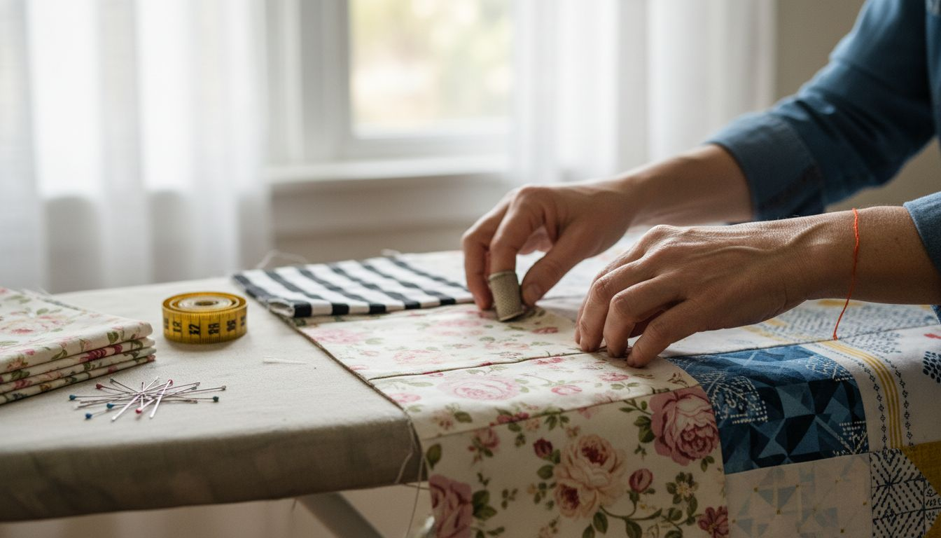
Before committing your final design, a mock quilt assembly helps you catch potential pattern misalignments and color conflicts. Quilters use preliminary block arrangements to preview how fabrics will ultimately interact.
Spread your selected fabric pieces on a large flat surface like a design wall or clean floor. Begin by loosely positioning blocks without permanently stitching them together. This technique allows you to experiment with different configurations and assess how patterns flow from one section to another. Look closely at seam intersections and transitions between blocks to ensure visual harmony. Pay special attention to how different pattern scales and color values play against each other creating interesting yet balanced visual rhythms.
Take multiple photographs of your mock assembly from different angles and distances. Digital images can help you objectively evaluate your layout by providing a fresh perspective. Review these photos critically and be willing to rearrange blocks multiple times until you achieve a composition that feels cohesive and intentional. Remember that slight adjustments can dramatically improve the overall aesthetic of your quilt design.
Pro tip: Use painter tape or repositionable adhesive to temporarily secure fabric blocks this allows easy rearrangement without risking fabric damage.
Matching fabric patterns seamlessly can feel overwhelming when planning your quilt design. The challenge lies in balancing colors, motifs, and scales to create a cohesive and visually striking quilt. This article highlights how thoughtful fabric choices, pattern analysis, and layout planning are key to achieving harmony in your quilting projects. Whether you are coordinating florals with geometrics or ensuring smooth color transitions, selecting the right fabrics is your first critical step.

Ready to bring your quilt vision to life with confidence? Discover a wide range of quality textiles at Fabric-Fabric designed to inspire and support every creative need. From versatile quilting cottons to complementary solids and vibrant prints, our collection simplifies the process of mixing and matching fabrics. Explore our curated fabrics online today and take advantage of exclusive deals and free shipping opportunities. Elevate your quilt’s design with the perfect fabrics chosen just for you. Start your seamless fabric shopping experience now at Fabric-Fabric and transform your quilting journey!
Choosing fabric patterns requires balancing colors and scales. Start by establishing a dominant color theme and then incorporate complementary prints that enhance visual flow. Aim for variety by mixing large and small patterns to maintain interest in your quilt design.
To assess color interactions, compare fabric samples in both natural and artificial light to see their true hues. Lay out your selected fabrics side by side to explore how they blend and contrast, ensuring that complementary colors enhance overall visual harmony.
Arranging fabric layout effectively involves applying design principles like the rule of thirds. Distribute different patterns evenly across your quilt to avoid clustering similar designs, allowing for a smooth visual transition that guides the viewer’s eye.
If you spot mismatched patterns during your mock-up, adjust your layout before final assembly. Rearrange fabric blocks to create a cohesive composition, making small tweaks until the overall arrangement feels intentional and balanced.
To ensure pattern scale harmony, mix large prints with smaller patterns or solids in your quilt. Aim for a balanced visual texture—combine at least two different sizes, such as a bold floral with a subtle geometric design for effective contrast.
Using a design wall allows you to visualize fabric combinations effectively. Arrange your selected pieces on the wall temporarily, allowing you to easily move and adjust configurations until you find the most appealing layout.