

 Canadian Dollars

What Does Jacquard Fabric Look Like? A Visual Guide
Posted by BLG on 2026 Aug 14th
Posted by BLG on 2026 Aug 14th

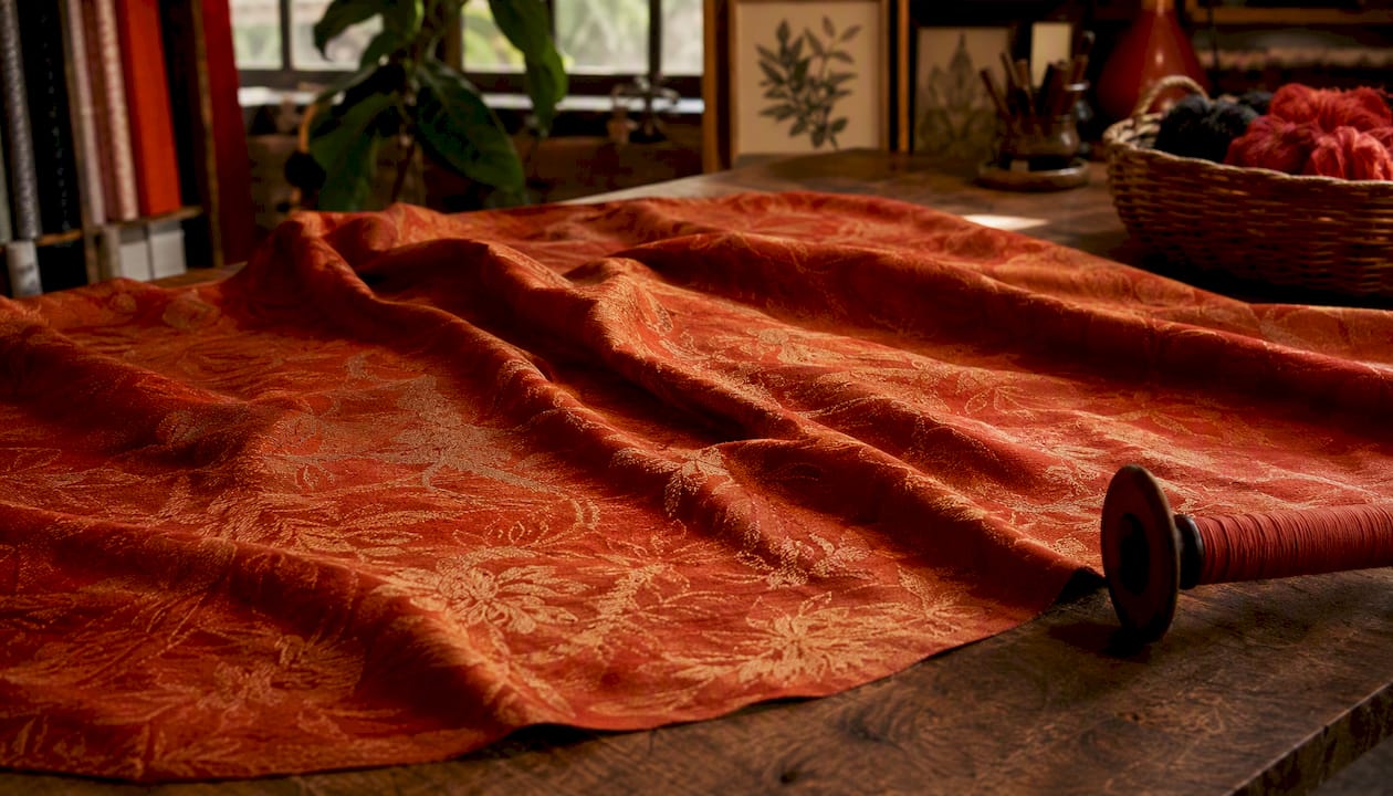
Jacquard fabric has a pattern woven directly into its structure, producing a raised, dimensional surface with visible sheen contrast between the design and its background. You’re not looking at ink or embroidery. The motif is built from the cloth itself, which gives it a subtle relief you can feel with your fingertips and see shift under light. At a glance, the key recognition cues are:
Three quick examples: damask looks like a two-tone reversible pattern, often floral or geometric, where the design and background swap when you flip the cloth. Brocade reads heavier and more ornate, sometimes with metallic threads catching the light. Matelassé looks quilted or padded without any actual batting underneath.
Jacquard fabric’s pattern is woven into the cloth itself, producing sheen contrast, dimensional texture, and a motif that outlasts any surface print.
| Point | Details |
|---|---|
| Woven-in pattern | The design is structural, not printed, so it shows on both sides and won’t fade or crack. |
| Sheen contrast | Alternating weave structures create figure/ground contrast without any pigment. |
| Type determines look | Damask reads subtle and reversible; brocade reads heavy and ornate; matelassé looks quilted. |
| Fiber changes character | Silk gives crisp, high-luster edges; cotton reads matte and soft; polyester holds sheen through washing. |
| Fabric-fabric swatches | Order a swatch from Fabric-fabric’s home decor or backdrop categories before buying yardage. |
The visual depth of jacquard comes from deliberately alternating weave structures. Where warp threads float over weft, the surface catches light and reads as bright. Where weft threads dominate, the surface absorbs more light and reads as matte or darker. That contrast, not pigment, is what creates the pattern. High-quality jacquard shows sharp pattern edges and consistent sheen contrast produced entirely by the weave structure.
Texture varies by type. Damask feels smooth but has a subtle relief you notice when you drag a fingertip across it. Brocade has a more pronounced raised surface. Matelassé feels almost padded, with a soft, pillowy texture. In all cases, the motif is woven into the cloth, giving it dimensionality and a longer-lasting appearance than surface prints.
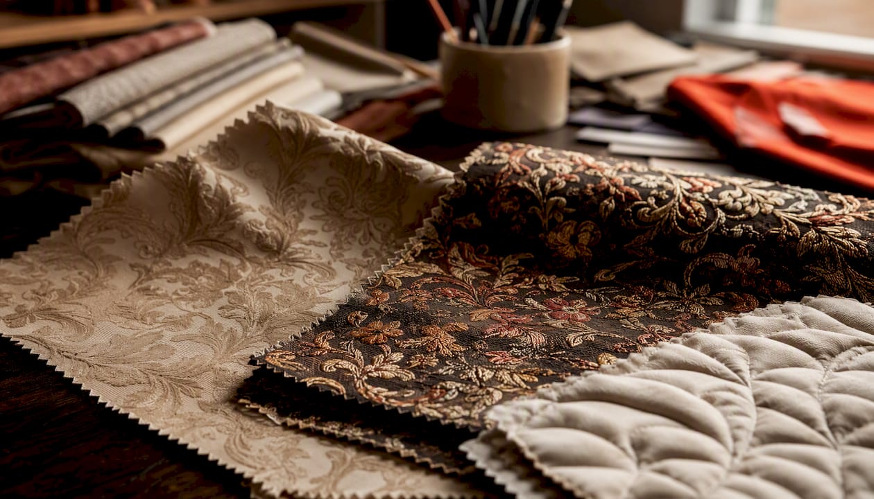
Under directional light, the sheen contrast becomes most obvious. Tilt the fabric at a 45-degree angle and the figure practically glows while the ground recedes.
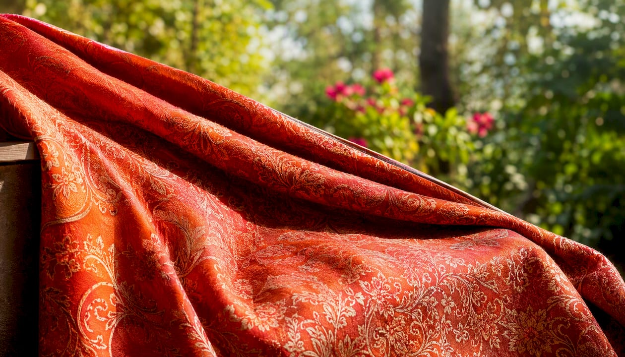
Pro Tip: *Hold a swatch under a single lamp at a low angle. If the pattern pops with a sheen shift and you can feel a slight ridge at the motif edges, it’s almost certainly woven jacquard.
Jacquard is a weaving method, not a single fabric, which is why the same loom can produce fabrics that look completely different from each other. Here’s how the main types read visually:
| Type | Visual character | Typical use |
|---|---|---|
| Damask | Two-tone, reversible; figure/ground swap on the back | Bedding, table linens, drapery |
| Brocade | Heavy, raised, ornate; often metallic threads | Upholstery, formal apparel, décor |
| Matelassé | Quilted or padded look; soft, pillowy texture | Bedding, jackets, home décor |
| Brocatelle | High-relief figure on flat ground; stiff hand | Upholstery, theatrical costumes |
| Tapestry jacquard | Pictorial, multi-color, dense; almost rug-like | Wall hangings, heavy upholstery |
A few things worth knowing about each:
For patterned fabric projects where visual impact matters, the type you choose determines how the finished piece reads from a distance.
The visual complexity of jacquard traces directly to one mechanical breakthrough: individual control of each warp thread. On a standard shaft loom, groups of threads lift together, limiting pattern complexity. The Jacquard mechanism lifts each thread independently, which is why the patterns can be so intricate.
Joseph Marie Jacquard introduced the punched-card system in the early 1800s, encoding which warp threads to lift on each pass of the shuttle. Each hole in a card corresponded to one thread. That one-to-one control made complex woven imagery possible for the first time at scale.
Modern Jacquard systems use digital design files and electronic selection instead of punched cards, but the principle is identical. The per-thread control lets weavers produce high-detail patterns, multi-colored effects, and complex textures by choosing which warp threads lift on every single pick.
Under a loupe, a jacquard weave looks like a precise mosaic of interlocked threads. At pattern boundaries, you’ll see the weave structure shift abruptly from warp-dominant to weft-dominant. That shift is the source of the sheen contrast you see with the naked eye. The selective lifting of warp threads creates woven imagery that was simply impossible on shaft looms.
Key things the loom control enables:
For a deeper look at the jacquard weaving process, the technical mechanics behind thread selection explain a lot about why different jacquard types behave so differently.
The same jacquard weave structure reads completely differently depending on what it’s made from. Fiber choice shapes pattern edge clarity, reflectivity, drape, and weight.
| Fiber | Visual character | Drape and weight |
|---|---|---|
| Silk | High luster, crisp edges, vivid sheen contrast | Fluid, lightweight |
| Cotton | Matte to sateen, softer contrast, warmer tone | Medium, structured |
| Polyester | Stable sheen, mimics silk, strong colorfastness | Variable, often crisp |
| Blends | Varies by ratio; often combines luster with durability | Depends on fiber mix |
Finish treatments push the visual character further:
Silk jacquard shows the sharpest pattern edges and the most dramatic sheen contrast. Cotton jacquard, including what is cotton jacquard in the bedding context, reads softer and more casual. Polyester jacquard holds its color and sheen through repeated washing, which is why it dominates the budget home-décor market. Understanding how fabric appearance is perceived in different lighting conditions helps when shopping online, where photography can flatten the dimensional quality jacquard is known for.
This is where a lot of shoppers get tripped up. Here’s a sequential inspection checklist:
For a broader fabric quality inspection guide, the same principles apply across fabric types.
One failure mode worth knowing: long warp or weft floats in cheaper jacquard can snag easily and, when pulled, distort the pattern. Blurred pattern edges usually signal poor loom tension during weaving, not a print. A three-dimensional woven pattern with good durability is the hallmark of quality jacquard; a flat, easily abraded surface suggests a print.
Jacquard shows up across a wide range of applications, and the same weave can look completely different depending on scale and context.
Lighting matters more with jacquard than with most fabrics. Under warm incandescent light, the sheen contrast intensifies. Under flat fluorescent light, the dimensional quality flattens. This is worth considering when choosing jacquard for a room with specific lighting conditions.
Jacquard’s woven structure makes it more durable than printed alternatives for pattern longevity, but the weave type and fiber determine how much care it needs.
Start with the end use, then work backward to fiber, weight, and pattern scale.
Pattern scale guidance: match the repeat size to the viewing distance. Large repeats (12 inches or more) need space to read correctly. Small repeats (under 3 inches) work for garments and accessories where the fabric is seen up close.
Pro Tip: Always order a swatch before committing to yardage. Jacquard looks different in person than in product photography, especially for sheen and texture. Wash the swatch once if the end use involves laundering, and inspect the reverse before buying.
Most people reach for jacquard because it looks expensive. The real reason to choose it is that the pattern doesn’t fade, crack, or peel. A printed fabric with the same motif will lose definition after a season of washing or a year of sunlight. The jacquard version looks the same in five years because the color is in the yarn, not on the surface.
There’s also a tactile argument. Jacquard has weight and presence that printed alternatives can’t replicate. For upholstery or drapery, that physical quality translates into a room that feels considered rather than assembled. For garments, it’s the difference between fabric that moves with intention and fabric that just hangs.
The one honest caveat: jacquard costs more and requires more care. For a craft project that will be washed weekly or a garment that needs to survive a busy season, a quality printed fabric may be the smarter call. But for anything meant to last, or anything where the textile itself is the design statement, jacquard is hard to argue against.
Choosing jacquard without touching it first is a gamble. Fabric-fabric carries a range of home decor fabrics including damask and brocade-weight options suited for upholstery, bedding, and drapery projects, with detailed product descriptions that specify fiber, weight, and finish.
For heavier decorative applications, the backdrop fabrics category includes upholstery-weight options where texture and pattern scale are clearly described. Order a swatch before committing to yardage. See the pattern in your lighting, feel the texture, and check the reverse. That one step saves a lot of regret on a big project.