

 Canadian Dollars

How to Choose Fabric for a Quilt: A Practical Guide
Posted by BLG on 2026 Aug 1st
Posted by BLG on 2026 Aug 1st

TL;DR:
- Choosing a focus fabric first enables clear value contrast and balanced print scales in quilt design. Using curated collections accelerates palette testing, ensuring cohesive results and saving time. The black-and-white test is essential for assessing value differences that keep the quilt visually lively and readable.
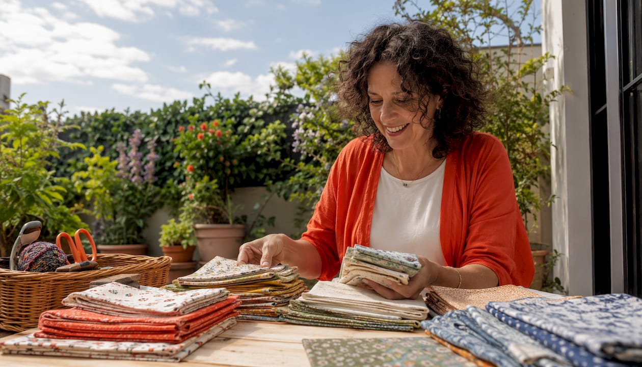
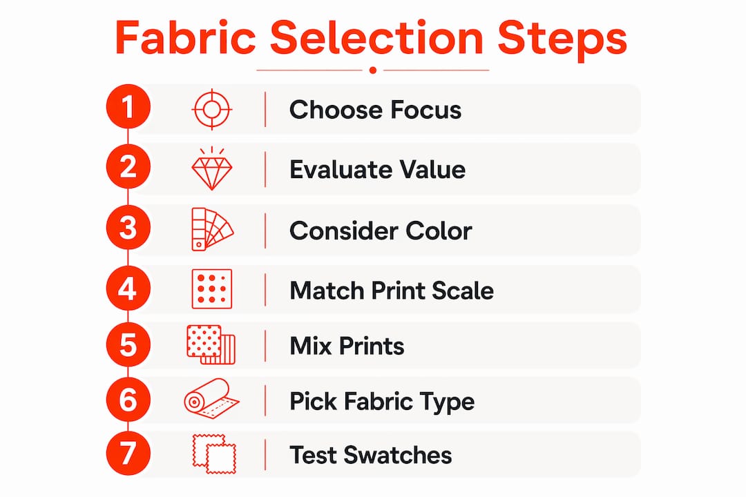
Choose a strong focus fabric first, then build around it with supporting fabrics that offer contrast in value and scale, and finish with neutral or background fabrics that give the eye a place to rest. That three-step pull method, backed by the APQS color framework and Beth Ann Williams’ beginner-friendly fabric-pull guide, is the fastest route from a pile of fabric to a quilt that actually works. Fabric-fabric’s curated quilting collections make the process even shorter if you’d rather not start from scratch.
Quick-start checklist:
Pre-cut bundles and curated collections exist for a reason: they remove the hardest part of quilt fabric selection, which is coordination. A fat-quarter bundle or jelly roll is already pulled by a designer who has done the value, scale, and undertone work for you. For a beginner, that is genuinely useful. For an experienced quilter on a deadline, it’s a shortcut worth taking.
The main formats you’ll encounter are fat quarters (18" × 22" cuts), jelly rolls (2.5"-wide strips), and charm packs (5" squares). Each gives you a sampler of coordinated prints from a single fabric line, which means the undertones already match and the scales are usually varied by design.
The catch is that bundles can skew toward medium values, leaving you without a strong light or dark. Before buying, check the selvedge dye dots on each print to confirm the palette contains the full value range you need. If the bundle runs too similar in value, swap in one “zinger” fabric at a higher contrast, or change the background fabric to shift the whole mood.
Pro Tip: Lay the bundle fabrics on a white surface and photograph them in natural light. Squint at the photo. If everything blurs into one tone, the bundle lacks value contrast and you’ll need to add a stronger light or dark before cutting.
Curated quilting fabric collections are the fastest, safest choice for gifts, baby quilts, or any project where you want a cohesive result without spending hours at the cutting table.
Value is the lightness or darkness of a fabric, independent of its color. A red and a green can have identical value, which means they’ll blend into each other in a finished quilt even though they’re completely different hues. Value contrast is what makes piecing readable. Without it, a quilt looks flat no matter how beautiful the colors are individually.
How to run the stand-back test:
Value is also relative. A fabric that reads as “light” next to a navy can read as “medium” next to white. That shift matters when you’re placing fabrics in a block, so always audition fabrics together, never in isolation.
Pro Tip: Aim for at least three distinct value levels in most quilts, including lights, mediums, and darks, to keep the design legible without looking too stark.
Hue is the color name — red, blue, green. Undertone is whether that color leans warm (yellow-based) or cool (blue-based). A warm red and a cool red can clash even though they’re both “red,” because their undertones pull in opposite directions. Undertone matching is often more decisive than matching hue names.
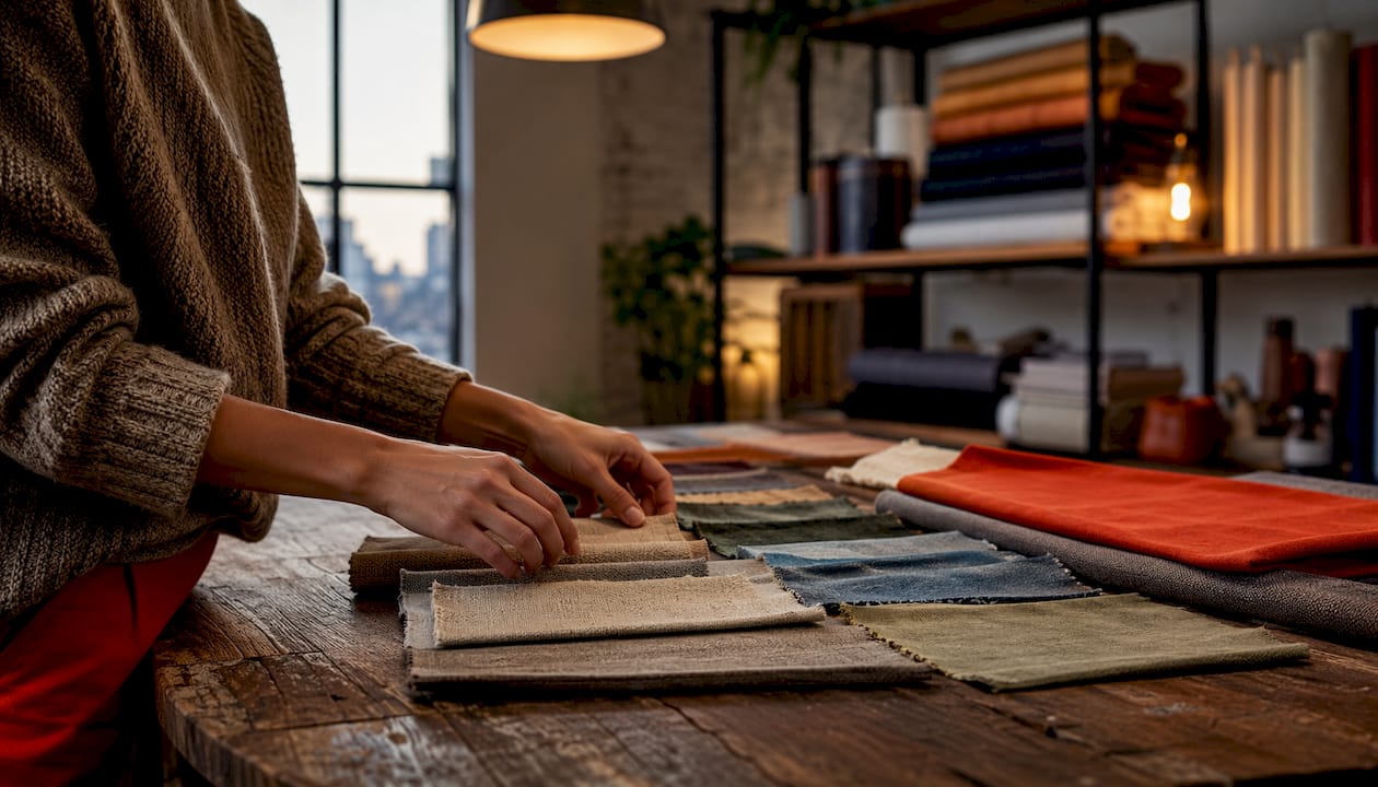
Saturation describes how pure or intense a color is. A fully saturated cobalt blue is electric. The same blue toned down with gray becomes a dusty slate. Both are “blue,” but they behave completely differently in a palette.
Practical checks for color harmony:
Pro Tip: When one fabric is very high-intensity, surround it with toned or grayed versions of the same color family. A single electric yellow-green reads as a zinger; three of them read as chaos.
Print scale refers to how large the motifs in a fabric are relative to the pieces you’re cutting. A large floral with 6-inch blooms will lose all its detail when cut into 2-inch squares. Conversely, a tiny ditsy print can look like a solid from a distance, which is sometimes exactly what you want.
Scale categories and where they work:
Large-scale prints can hide piecing detail in small blocks, so the standard approach is one primary large-scale anchor fabric paired with several smaller-scale prints or solids. That combination preserves the design language of the block while still giving the quilt visual interest.
Pro Tip: Cut a sample piece at your actual block size from each candidate fabric and lay them on a design wall before committing. A print that looks perfect on the bolt can disappear or overwhelm once it’s cut to size.
The most common mixing mistake is treating every fabric as equally important. A quilt needs a hierarchy: one fabric leads, a few support, and the rest recede. Solids and low-volume prints (fabrics with very subtle, tone-on-tone patterns) are what make that hierarchy possible.
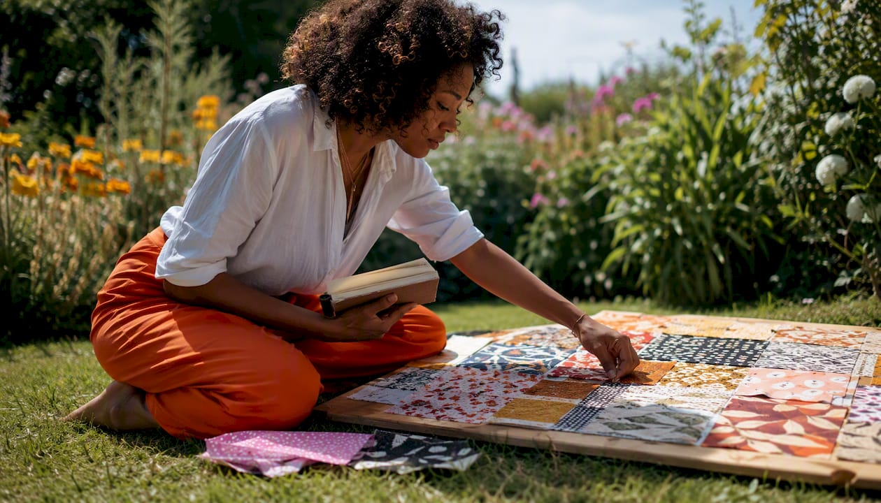
A low-volume print gives you texture without competing. It reads almost as a solid from a distance but adds depth up close. Solids, on the other hand, are clean and graphic. They strengthen a palette when the prints are busy, but they can make a quilt feel flat if overused without enough print variety nearby.
Mixing guidelines:
Pro Tip: Pick one color family for your prints and vary the intensity and scale within that family. A palette of dusty blue, bright teal, navy, and a pale blue-gray reads as intentional. The same four blues in the same saturation reads as monotonous.
100% quilting cotton is recommended for most quilters because it has minimal stretch, holds a pressed crease, and is widely available in quilting prints. It frays predictably, cuts cleanly, and behaves consistently through washing. For beginners especially, it removes a lot of variables.
When you’re buying, hold the fabric up to light. A tight weave with little transparency signals better quality. Loosely woven cotton frays more and distorts under the presser foot.
Flannel adds warmth and softness, making it popular for baby quilts and throws. It does stretch slightly on the bias, so cut carefully and use a walking foot when quilting. Batiks are tightly woven and have very little grain distortion, which makes them a pleasure to cut but harder to hand-quilt through. Linen and rayon add beautiful drape but require more careful handling and are better suited to experienced quilters. Blended fabrics (cotton-polyester) are durable but don’t press as crisply and can be harder to hand-quilt.
Pro Tip: If you choose not to prewash, cut all pieces slightly larger than needed and expect a small amount of shrinkage after the first wash. For quilts that will be washed frequently, prewashing is worth the extra step.
Fabric weight also affects the finished quilt. Heavier fabrics (home-decor weight, canvas) create a stiffer quilt with less drape. Standard quilting cotton produces a quilt with good loft and flexibility. Mixing weights in the same quilt can cause uneven quilting tension, so stick to similar weights across your fabrics.
A zinger is a high-intensity, high-contrast fabric that energizes a palette. Think a bright coral in a muted blue-gray quilt, or a lime green in a navy-and-cream scheme. Used well, it makes the whole quilt feel alive. Used carelessly, it hijacks the design.
Selecting a zinger:
Placement tips:
Pro Tip: The zinger should lead the eye to the focus fabric, not away from it. If your eye goes straight to the zinger and stops there, reduce its quantity or lower its intensity slightly.
Auditioning is the step most quilters skip and later regret. Cutting a few swatches and sewing one test block takes less than an hour and can save you from discovering a problem after you’ve cut 40 squares.
Audition workflow:
What to look for:
Ordering small swatches or fat quarters before committing to full yardage is a low-risk way to audition color and scale in a real pull. A fat quarter gives you enough fabric to sew several test blocks and confirm the palette works before you buy 3 yards of something that turns out to be the wrong value.
Pro Tip: If your palette feels too busy, swap the background for a low-volume print or a solid. A quieter background immediately calms competing prints and makes the piecing pop.
Even experienced quilters fall into the same traps. Knowing the most common errors makes them easier to spot before you cut.
Common errors and their fixes:
Last-minute fix checklist before cutting:
Blair Stocker at APQS frames fabric roles as “diva” and “chorus.” Diva fabrics are warm, pure in color, and medium-to-dark in value. They demand attention. Chorus fabrics are cooler, toned down, and lighter or medium in value. They support without competing. Balancing these roles is what prevents a quilt from feeling chaotic or, at the other extreme, dull.
A practical starting ratio is roughly one to two diva fabrics per several chorus fabrics and background/neutral fabrics. Scale it up for larger quilts by adding more chorus fabrics, not more divas.
Sample palette — bold:
Sample palette — toned:
Pro Tip: If you want the background to be the standout instead of a print, reverse the roles: use a bold, saturated solid as the background and keep all your prints in toned, low-intensity versions. The background becomes the diva, and the prints become the chorus.
A quilt that looks beautiful on the design wall needs to survive real use. Durability starts with fabric quality. A tight weave with consistent printing handles better, frays less, and holds up through repeated washing more reliably than a loosely woven print.
Colorfastness is a particular concern with deeply saturated fabrics — reds, purples, and dark blues are the most likely to bleed. Test a small swatch in warm water before cutting. If the water runs colored, prewash the entire piece with a color-catcher before it goes into your quilt. Mixing a fabric that bleeds with a pale background is a risk not worth taking.
Shrinkage varies by fiber content. 100% cotton typically shrinks 2–3% in the first wash. Flannel can shrink more. Prewashing eliminates most of that shrinkage before cutting, so your finished quilt won’t pucker after the first laundry cycle. For quilts that will be washed frequently — children’s quilts, everyday throws — prewashing is non-negotiable.
Fabric costs vary widely depending on fiber content, print complexity, and where you buy. Standard quilting cotton from a local shop or online retailer typically runs $10–$15 per yard. Designer prints and licensed fabrics can run higher. Basics, solids, and muslin are usually at the lower end.
Planning yardage:
Buying swatches or fat quarters first is the most cost-effective way to audition a palette before committing to full yardage. It’s far cheaper to discover a value problem on a $3 fat quarter than after buying 3 yards of the wrong fabric. A fabric sourcing checklist can help you track what you’ve ordered and what you still need before you cut.
Choosing quilt fabric comes down to one focus fabric, clear value contrast across your pull, print scales matched to your block size, and at least one audition step before you cut yardage.
| Point | Details |
|---|---|
| Focus fabric first | Start with one medium-to-large print that contains several colors you love, then build around it. |
| Value contrast is non-negotiable | Use the black-and-white photo test to confirm you have distinct lights, mediums, and darks. |
| Match print scale to block size | Large-scale prints lose detail in small pieces; use one anchor print and support it with smaller scales. |
| Audition before cutting | Sew one test block and photograph it from 10 feet before committing to full yardage. |
| Fabric-fabric for curated pulls | Fabric-fabric’s quilting collections and fat-quarter options let you test palettes before buying full yardage. |
The biggest barrier most quilters face isn’t color theory or value contrast. It’s the fear of cutting into a fabric they love. You find the perfect floral, it’s exactly right, and then you can’t bring yourself to cut it because what if you ruin it?
Here’s the thing: the fabric is not the quilt. The quilt is what happens after you cut. Every technique in this guide — the stand-back test, the diva-chorus ratio, the black-and-white photo check — exists to give you enough confidence to make the cut without second-guessing yourself for three weeks. The quilters who improve fastest are not the ones who study color theory the longest. They’re the ones who sew a test block, see what’s wrong, fix it, and cut. Practice with real fabric beats perfect planning every time. The rules here are guardrails, not a cage. Once you understand why value contrast matters, you’ll know exactly when you can break it on purpose.
Fabric-fabric carries a curated range of quilting cottons organized by color family and print scale, so you can build a pull without hunting across a dozen different sources. Fat quarters and smaller cuts are available, which means you can order a few candidates, run your audition, and only buy full yardage once the palette is confirmed. That approach costs less than discovering a value problem after you’ve already cut your pieces.
Browse the quilting collections at Fabric-fabric, order a small swatch set to test your palette at home, and cut with confidence.