

 US Dollar

15 Minute Tests to Pick Quilt Fabric for Beginners, Value First
Posted by BLG on 2026 Aug 28th
Posted by BLG on 2026 Aug 28th

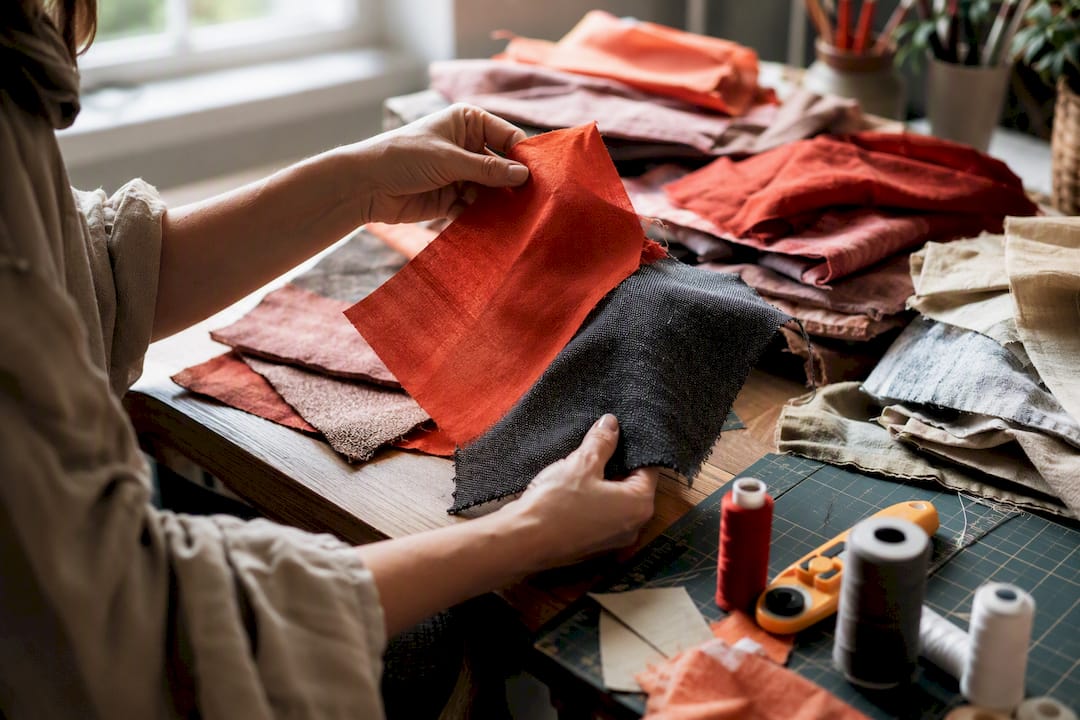
Four decisions determine whether a quilt reads clearly: fabric type, value, print scale, and placement. The sections below show you exactly how to test and buy fabric so those four decisions actually work together.
TL;DR:
- Choosing fabrics with distinct grayscale value contrast ensures quilt shapes are clearly visible, with at least three value groups recommended.
- Quilting cotton with a weight around 110 to 120 gsm provides consistent pressing, crisp seams, and reliable handling for patchwork quilting.
- Large-scale prints work best in large, uncut areas, while small prints suit tiny blocks; always test medium prints before full yardage.
- Purchasing extra fabric—10 to 20 percent—is essential to accommodate matching, fussy cutting, and potential mistakes, especially for busy or directional prints.
- Online shopping benefits from swatch requests, checking fiber content, scale, and value range, while local shops offer tactile inspection and immediate feedback.
Hue is simply the color name, red, blue, gold. Intensity describes how bright or dulled that color is. Value is how light or dark a fabric reads, and of the three, it does almost all the heavy lifting in a pieced quilt.
Quilters have a saying for this: color gets the credit, but value does the work. You can build a gorgeous quilt out of fabrics that clash on the color wheel, as long as their values contrast enough to separate the shapes. You can also pick a “perfect” coordinated color palette and still end up with a blurry, shapeless quilt if every fabric sits at roughly the same value. The eye reads light against dark long before it registers red against green.
This is why so many first quilts look muddier than the quilter expected. They picked fabrics that matched in tone, three medium blues, two medium greens, a medium print, and nothing in the stack was dark enough or light enough to define the block pattern. The pattern was there. The eye just couldn’t find it.
Pro Tip: Take a photo of your fabric pull and convert it to black-and-white using your phone’s editing tools. If two fabrics disappear into each other in grayscale, they’re too close in value to use next to each other in a block.
A few fast, no-equipment tests separate the fabrics that will work from the ones that won’t:
A reliable target is at least three distinct value groups in grayscale, light, medium, and dark, when a fabric group is checked for tonal separation. Fewer than that, and blocks tend to lose their shape.
None of this means high contrast is always the goal. Low-contrast, tonal quilts, where every fabric sits close in value but the hues shift subtly, can be stunning for a quilt meant to read as texture rather than pattern, like a wholecloth-style design or a background for heavy quilting. High-contrast palettes suit anything where you want the block pattern to pop from across a room, a sampler quilt, a bold geometric design, or a quilt going into a show. Decide which effect you want before you start pulling fabric, because the value strategy that serves one goal will undercut the other.
One more nuance worth knowing: a single small patch of a light fabric surrounded by darks can act as a focal point and read as “light” even in a mostly dark quilt. Quilters use this trick deliberately to create sparkle or draw the eye to a specific spot in the design, a strategically placed light square, star point, or accent strip can lift an entire dark quilt without changing the overall palette.
It cuts cleanly with a rotary cutter, presses flat without scorching or shine, holds a crisp seam, and barely stretches, which matters enormously when you’re matching corners across dozens of small pieces.
Quilting cotton isn’t the same as generic craft cotton or apparel cotton. It’s woven with a tighter, more consistent thread count and a stable weight, typically in the 110 to 120 gsm range, which is what makes it feed evenly through a home sewing machine and hold its shape once pressed. That consistency is exactly what lets a quarter-inch seam allowance stay a quarter inch, block after block.
A few fabric types cause trouble in patchwork and are worth avoiding, at least for your first several projects:
Cotton blends and specialty fabrics, cotton-linen, batiks, or a Kona-style solid, still work well, but each changes your handling slightly. Linen blends press with a little more texture and can fray more at the edges, so a slightly wider seam allowance or a zigzag finish on raw edges helps. Batiks are tightly woven and often feel stiffer, which some quilters love for precision piecing and others find harder to needle by hand.
When you’re shopping online rather than touching bolts in a shop, read the fiber content line in the product description closely, and request a swatch before committing to yardage on an unfamiliar print. A swatch tells you the hand, the weight, and the true color faster than any product photo, and it costs far less than discovering a mismatch after you’ve already cut into several yards.
Print scale and block size need to be sized to each other, or the print either disappears into confetti or overwhelms the shape it’s cut into. Small blocks, anything under about three inches finished, generally call for small-scale prints, tone-on-tones, or near-solids, because a large motif cut into a two-inch triangle just becomes an unreadable smear of color.
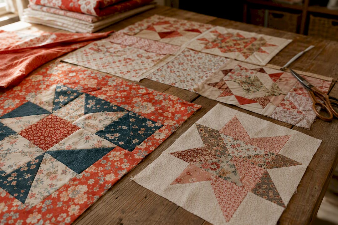
Large-scale prints need room to breathe. A big floral or bold geometric print works best in large, uncut areas, borders, backgrounds, or backing, rather than chopped into a nine-patch. If you love a large print and still want it in smaller pieces, fussy cutting is the answer: centering a specific motif inside each cut piece so the repeat lines up consistently from block to block. It takes more planning and noticeably more yardage than a random cut, since you’re often sacrificing fabric between motifs to preserve the ones you keep.
Medium-scale prints are the trickiest category because they can behave like either large or small prints depending entirely on how they’re cut and where they land in the block. Test a medium print by cutting one sample piece at your actual pattern size before committing to a whole yard’s worth of pieces cut that way.
A few placement habits keep busy prints from turning a quilt top into visual noise:
The fastest reliable method for pulling a palette is the three-tone rule, and it works whether you’re picking three fabrics or thirty.
Pre-cut bundles and curated fabric collections shortcut a lot of this work, since someone has already coordinated the hues for you. Before you buy one, check that the bundle actually spans a real value range, not just five medium-toned prints that all sit in the same visual lane, and confirm the fiber content is 100% cotton if that’s your goal.
Pro Tip: Before cutting into your full yardage, sew one small test block using scraps or fat quarters from your pull. It takes fifteen minutes and will show you problems, like two fabrics reading as twins, that no amount of staring at folded fabric on a table will reveal.
If a combination “reads wrong” once sewn, the fix is usually simple: swap the medium fabric for something closer to the light or dark end, rather than throwing out the whole palette.
The single most common mistake is ignoring value entirely and shopping by color preference alone, which is how quilters end up with beautiful fabric that goes muddy the moment it’s pieced together. A close second is using an oversized print in a small block, where the motif gets chopped into meaningless fragments instead of reading as intended.
Trusting your phone’s screen or a monitor for true color is another frequent trap; screens shift color constantly depending on lighting and settings, so what looks navy on your phone can arrive closer to true black. And skipping the “buy extra” step is a mistake that only reveals itself weeks later, when a discontinued print leaves you short a quarter yard with no way to match it.
Four fast checks catch most of these problems before you cut:
If you do come up short on fabric mid-project, buy extra immediately rather than waiting, dye lots and print runs change, and a print that’s available today may not be next month. When a print is genuinely discontinued, plan a deliberate substitution using your three-tone rule rather than hunting for an exact match that no longer exists.
Buy the yardage your pattern calls for, then add 10 to 20% extra, especially for busy prints where you’ll need to account for pattern matching, fussy cutting, or simple cutting mistakes. Check the bolt width before finalizing your math, since quilting cotton commonly comes in 42 to 44 inch and occasionally wider bolts, and that width directly affects how many pieces you get per yard.
Prewashing is a personal choice rather than a strict rule. It removes sizing and shrinks the fabric before it’s sewn into a quilt, which matters most if you’re mixing fabrics with different fiber contents or plan to wash the finished quilt aggressively. If you skip prewashing, at minimum test colorfastness on any strongly saturated red, purple, or navy print by wetting a corner and blotting it against white cotton.
Requesting swatches before ordering full yardage is worth the small extra cost, especially for value and scale checks you can’t make accurately from a product photo alone. When shopping online, read the full product description for fiber content and repeat size, and browse organized quilting fabric collections to compare value and scale side by side before adding anything to your cart.
Curated bundles and category pages exist specifically to cut down the decision fatigue that comes with staring at hundreds of individual prints. Before trusting any bundle, confirm three things: it spans a genuine light-to-dark value range, it’s listed as 100% cotton if that’s your target fiber, and the yardage quantities match what your pattern actually needs.
Product images and swatches on Fabric-fabric let you check scale and value before committing to yardage, which matters most for prints you can’t evaluate accurately on a screen. If you’re building a palette around a bold focal print, the geometric quilting fabric collection is a useful place to see how scale and repeat size are presented across a range of prints. For readers who want a store-specific walkthrough of the buying process, the practical guide to choosing quilt fabric covers ordering and swatch steps in more depth.
| What to check | Why it matters |
|---|---|
| Value range in a bundle | Prevents low-contrast, muddy blocks |
| Fiber content listed | Confirms true 100% cotton behavior |
| Repeat size shown in photos | Needed for accurate fussy cutting |
| Bolt width noted | Affects yardage math and piece count |
If you’re piecing patterns that need precise motif placement, the guide to matching fabric patterns walks through repeat alignment in more detail than a product listing alone can offer.
Weight and thread count together determine how a fabric handles under a needle, and quilting cotton earns its reputation because it sits in a narrow, predictable range. Most quilting cotton falls around 110 to 120 grams per square meter, dense enough to hold a crease and a seam, but light enough to press flat without adding bulk at intersections.
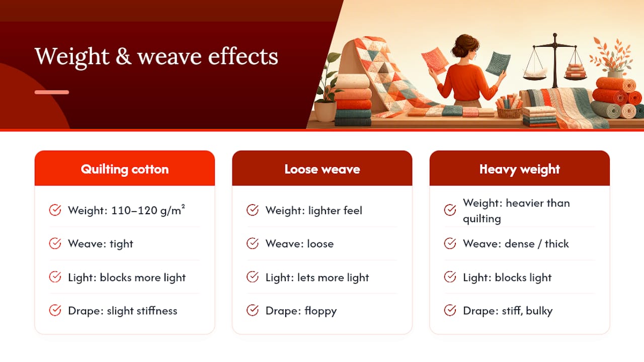
Thread count matters less as a marketing number and more as a feel test. A tightly woven cotton resists fraying at quarter-inch seams and holds up to unpicking mistakes, which every quilter does more often than they’d like to admit. A loosely woven fabric, even if labeled quilting cotton, can shed threads at the cut edge and distort under a hot iron.
If you’re comparing two fabrics and can’t tell which is heavier from a product photo, hold a swatch up to a light source. Tightly woven, higher-thread-count cotton blocks more light and drapes with a slight stiffness, while loosely woven fabric lets more light through and feels floppier in hand. Heavier home decor and upholstery-weight fabrics, sometimes tempting for their bold prints, generally run too thick for standard patchwork piecing and are better reserved for backings, tote bags, or borders where bulk isn’t a problem.
Quality shows up in specific, checkable details rather than a vague sense of “nice fabric.” Hold a swatch up and look for an even, tight weave with no visible slubs or thin spots, since thin spots weaken over time and can tear along a seam line.
Check the print itself under good light. A well-printed fabric shows the design clearly on the front with color that’s saturated but not bleeding into the surrounding threads, and ideally the color has penetrated most of the way through to the back rather than sitting only on the surface. Fabric that’s printed shallow, showing mostly white on the reverse, tends to look washed out faster with repeated laundering.
Feel for a crisp hand rather than a limp or overly soft one straight off the bolt, since quilting cotton should have some body to it before you’ve even prewashed. Fraying at a cut edge is normal to a point, but excessive shedding the moment scissors touch the fabric usually signals a looser weave that won’t hold up to years of handling. When shopping online, product descriptions that specify gsm, fiber content, and country of origin tend to come from retailers who’ve actually tested what they’re selling, rather than reselling unknown stock.
A quilt’s lifespan depends heavily on the fibers you chose before the first stitch went in.
Fiber blends introduce a durability trade-off worth understanding. A cotton-polyester blend can resist wrinkling better, but the two fibers sometimes age at different rates, causing subtle puckering along seams after repeated washing as one fiber shrinks slightly more than the other. Pure cotton fabrics that are matched in weight and construction age together more evenly.
Thread quality matters just as much as the fabric itself; a beautiful cotton top sewn with cheap, weak thread will fail at the seams long before the fabric itself wears out. Pairing quality quilting cotton with a good quality all-purpose or quilting-weight thread protects the investment you’ve already made in fabric selection. Quilts meant for daily use, baby quilts, lap quilts, and bed quilts that see regular washing benefit most from sticking with tightly woven cotton throughout, reserving delicate or loosely woven specialty fabrics for wall hangings and decorative pieces that won’t face the same wear.
Grain refers to the direction threads run in woven fabric, and cutting pieces off-grain is one of the quieter causes of a quilt that won’t lie flat. Fabric cut along the straight grain, parallel to the selvage, has minimal stretch and holds its shape through cutting, piecing, and pressing. Cut on the bias, at a 45 degree angle to that grain, and the same fabric stretches considerably, which is sometimes useful for binding curved edges but disastrous for straight-edged patchwork pieces that need to stay a fixed size.
Most quilting patterns assume straight-grain cutting unless they specifically call for bias strips, so check your pattern’s cutting instructions before laying out your ruler. A rotary cutter and a clear grid ruler make it easy to align cuts with the fabric’s woven grain rather than guessing by eye.
Nap is a separate consideration that mostly applies to fabrics with directional texture or printed motifs that clearly face one way, an animal print, a directional floral, or true napped fabrics like velveteen. Cutting pieces without accounting for nap direction can leave some blocks looking subtly “off” compared to their neighbors, since light reflects differently depending on which way the nap or print faces. For most standard quilting cotton with non-directional prints, this isn’t a concern, but it’s worth a second look any time you’re working with a fabric that has an obvious visual direction to it.
Local quilt shops offer something online shopping can’t fully replace: the ability to touch, drape, and hold fabrics next to each other under real lighting before you commit to a single yard. A good local shop’s staff can also spot problems, a print that’s actually a home decor weight mislabeled as quilting cotton, for instance, faster than any product description would reveal.
Online retailers make up ground with breadth and convenience. A single online catalog can carry far more prints, colorways, and specialty collections than most brick-and-mortar shops have shelf space for, and organized category browsing lets you compare value and scale across dozens of options in minutes rather than driving between stores. The trade-off is that you’re relying on product photography and written descriptions instead of your own hands, which is exactly why requesting a swatch before buying yardage matters so much for online orders.
Reliability with either channel comes down to the same few signals: clear fiber content listed, accurate color representation, responsive customer service if a shipment arrives different from expected, and a return or swatch policy that lets you verify before you commit to full yardage. Neither local nor online sourcing is inherently better, they solve different problems, and most quilters end up using both depending on the project.
Fiber origin is the first environmental question worth asking, since cotton farming’s water and pesticide use varies enormously depending on growing practices, and organic or responsibly farmed cotton options are increasingly available from mainstream quilting fabric suppliers. Certifications on a product listing, when present, are a faster way to verify these claims than trying to research a specific mill or farm yourself.
Production practices matter too. Fabric printed and finished under fair labor standards, and dyed using processes that limit water pollution, represents a meaningfully different supply chain than fabric produced without those safeguards, even when the finished product looks identical on a bolt. Buying fabric with a longer usable lifespan, sturdy quilting cotton that will survive decades of use and washing, rather than trend-driven prints likely to feel dated in a year, is itself a form of environmentally conscious shopping, since a quilt made to last reduces the overall demand for replacement textiles over time.
Scrap and remnant use closes the loop further. Many quilters now build entire scrap-quilt traditions specifically around minimizing fabric waste, cutting usable pieces from leftovers rather than discarding them, which is worth considering as you plan yardage for a new project.
Start with cotton, keep your first few projects small, and let experimentation happen gradually rather than all at once. Every quilter who now pulls a gorgeous palette in ten minutes once stood in front of a fabric wall completely unsure where to start.
Value testing and a tiny trial block will teach you more in twenty minutes than reading another article ever could, so use them liberally, on every project, for years. Mistakes are how the eye trains itself to see value over color. Share a fabric pull or a finished block with other quilters when you can; outside eyes catch value problems your own eyes have gone blind to from staring too long.
— kev
Fabric-fabric turns the value-first method above into an actual shopping list. Instead of scrolling hundreds of unrelated prints, you can browse curated bundles built around a coherent light-medium-dark range, order sample swatches before committing to yardage, and read product descriptions that specify fiber content and scale up front.
Fat quarter bundles are a fast way to test the three-tone rule without buying full yardage of five different prints, and individual swatches let you run your own grayscale photo test at home before a single yard ships. If a project calls for a large-scale focal fabric or backing, the backdrop fabrics collection is worth a look for pieces sized to work as borders or full-width backing rather than pieced into small blocks. Browse the current quilting fabric selection and start with a swatch order on any print you’re unsure about. It costs less than a wasted yard and settles the value question before you ever pick up a rotary cutter.